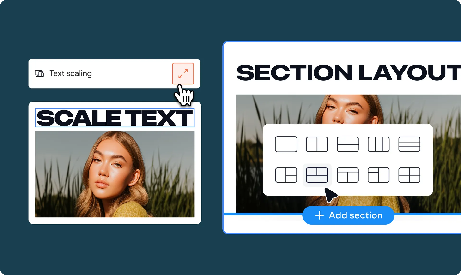
Text joins the responsiveness party
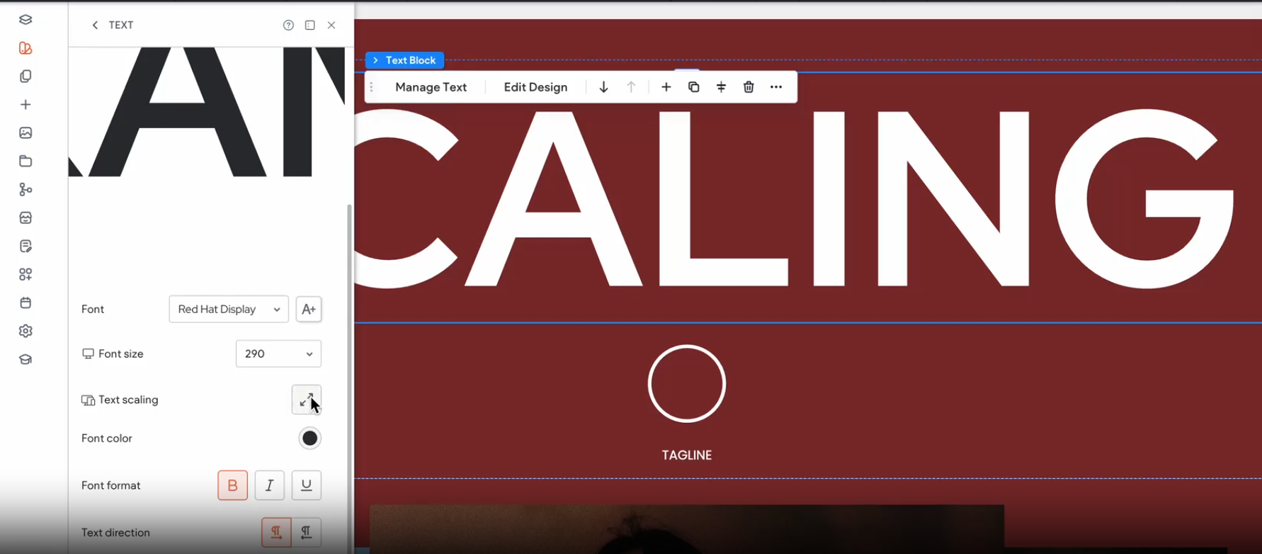
We’ve added a new text scaling setting to the Text widget and the Site Theme > Text section, to make responsiveness even more seamless in your sites.
When turned on, text size will automatically adjust relative to the screen size of the visitor seeing your site. This improves readability, responsiveness, and accessibility.
Hit the canvas running with a collection of blank section layouts
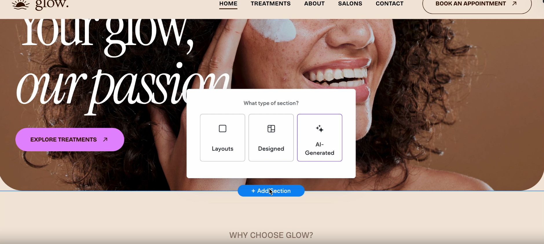
When you hit +Add Section in the editor, you'll now see a Layout option with predefined blank layouts. This helps you quickly find the exact combination of flex elements you need.
Save time and keep your design consistent with site-wide column spacing
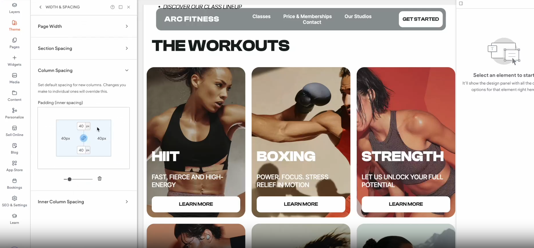
We've added a column and inner column spacing setting to the new Width & Spacing section in your Site Theme. This lets you set site-wide spacing for any new column or inner column you add.
Keep in mind that any spacing edits you make to a specific column will override this site-wide rule.
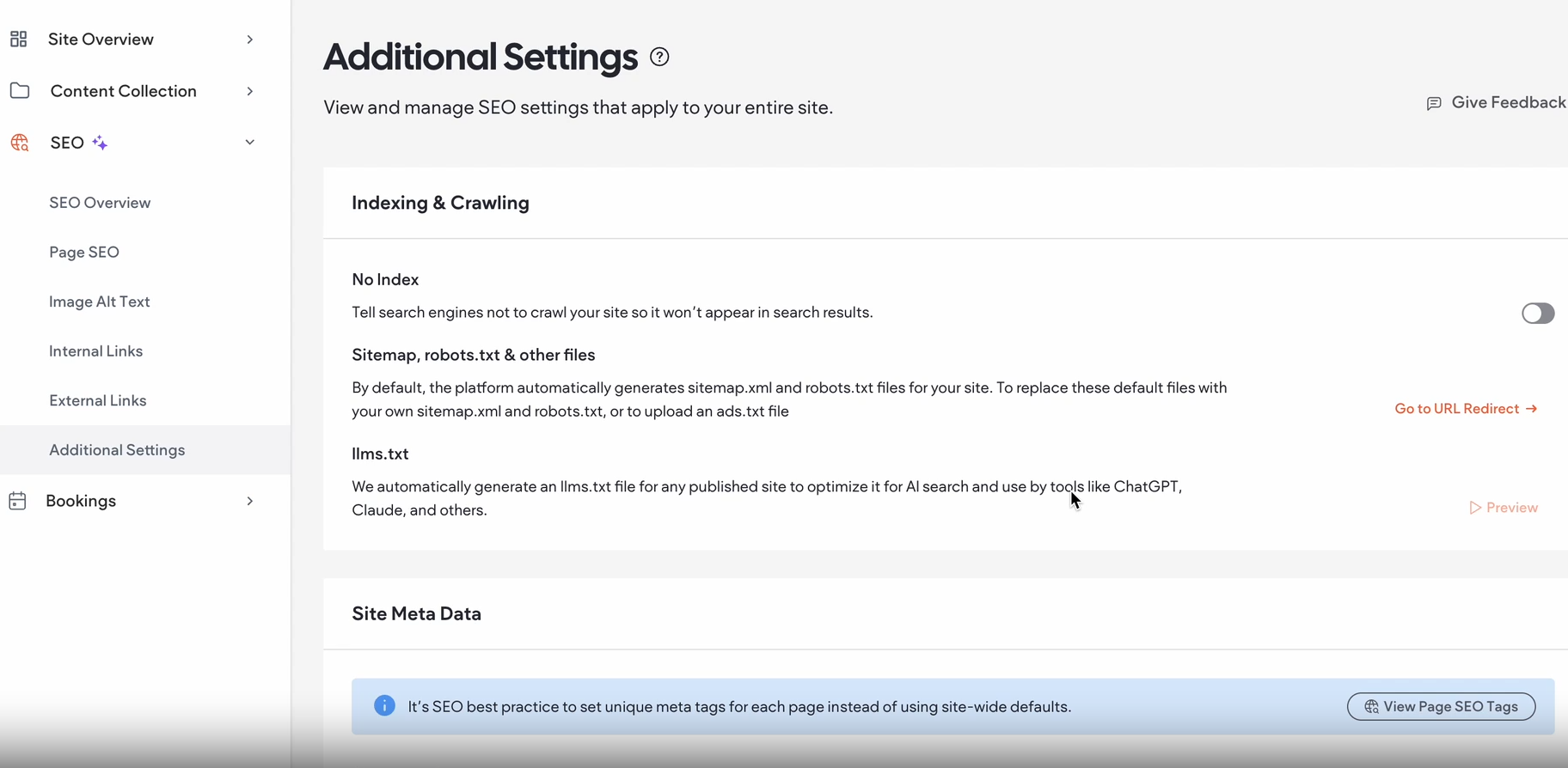
One convenient place for all SEO settings
We've consolidated SEO-related settings in your site dashboard to reduce clutter and give you a more intuitive way to manage your site's SEO.
The SEO manager in your site dashboard now includes a new Additional Settings section where you can manage:
Indexing & crawling: Configure whether your site should be indexed by search engines, view the LLMs.txt file, or quickly navigate to URL Redirect.
Site meta tags: Set your site's meta title and description.
Was this article helpful?
That’s Great!
Thank you for your feedback
Sorry! We couldn't be helpful
Thank you for your feedback
Feedback sent
We appreciate your effort and will try to fix the article